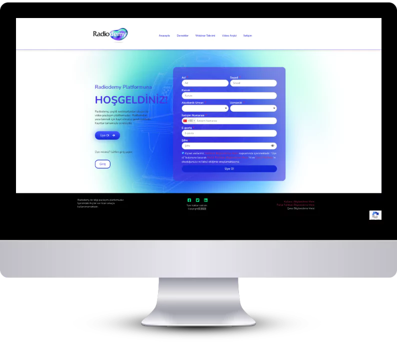
RadioDemy, is a web portal project of Opakim, one of the leading pharmaceutical companies in Turkey operating in the field of radiology. The website collaborates with radiology associations and regularly hosts webinars with experts in the field and serves as an archive for users. The goal is to bring together professionals and stay up to date on the latest developments in radiology. The portal was branded with a name and design that reflected its focus on education and professionalism in the field.

Opakim aimed to bring together the latest developments in radiology, as well as expert and skilled radiologists and radiologist candidates. To achieve this goal, they needed a framework that would bring professionals together. They also aimed to create a brand name and branding that would reflect the seriousness of the project and appeal to the target audience.

We kicked off the project by finding the perfect name. We wanted the name to be both easily understandable and reflective of the work we do. At the same time, we aimed to convey the seriousness and professionalism of our brand. That’s how we came up with the name RadioDemy, a combination of the words Radiology and Academy.
The world of radiology may be associated with black and white, but we believed that life is much more colorful. So, when it came to branding, we chose to use a softer color palette of warm and cool hues. We designed a logo that was modern and strong, and used it to set the tone for the portal’s overall aesthetic, with colors and logo playing a major role.